...
Allows the user to select a date from a pop-up calendar or select list, or enter a date in a text field.
| Expand | ||
|---|---|---|
| ||
  Date field using the "Text field" widget type.   Date field using "Select list" widget type.   Date field using the "Pop-up calendar" widget type. |
...
| Expand | ||
|---|---|---|
| ||
  Decimal field using the "Select (or other) check boxes/radio buttons" widget type. 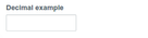 Decimal field using the "Text field" widget type. 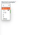 Decimal field using the "Select (or other) list" widget type. |
...
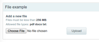
Allows a user to upload a file. Use the “File” widget and do not enable “Enable Display field” option.
| Expand | ||
|---|---|---|
| ||
  |
Float
Allows the user to enter or select a number, stored as the float datatype. Float field is the same as Field Type Definitions#decimal, except that you cannot set a fixed number of integer and fractional digits.
...
| Expand | ||
|---|---|---|
| ||
 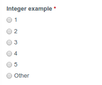 Integer field using the "Select (or other) check boxes/radio buttons" widget type.  Integer field using the "Select (or other) " widget type.  Integer field using the "Text field" widget type. 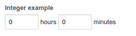 Integer field using the "Time period (select)" widget type. |
...
Allows the user to enter a URL and description.
| Expand | ||
|---|---|---|
| ||
  |
List (float)
Allows the user to select from a list of numbers. Stored in float format.
...
Allows the user to select from a list of text either as select list, radio, or checkboxes. Stored as text.
| Expand | ||
|---|---|---|
| ||
 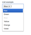 List field using the "Select list" widget type and set to allow unlimited values.   List field using the "Multiple select lists" widget type and set to allow 3 values.   List field using the "Select list" widget type and set to allow 1 value. |
...
| Expand | ||
|---|---|---|
| ||
  |
Long text
Allows the user to enter a paragraph or more of text.
...
| Expand | ||
|---|---|---|
| ||
  Phone number field with country code and extension enabled.   Phone number field without country code or extension. |
...
| Expand | ||
|---|---|---|
| ||
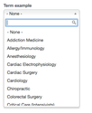 Term field using the "Select lists" widget type.   Term field using the "Check boxes/radio buttons" widget type with the "number of values" configuration set to unlimited. 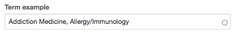 Term field using the "Autocomplete term widget" widget type. 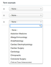 Term field using the "Multiple select lists" widget type with the "number of values" configuration set to 3. |
...